
Let’s talk some more about colour.
I’ve been in the little turquoise cube for nearly two years now, it’s nearly time to renew my mortgage and all of my bills are going up, so it feels like an excellent and timely moment to get antsy about the decor in the two rooms I’m least satisfied with, and start musing expensively on all the colours I could stick my fingers into.
I like colour a LOT, and I like to surround myself with it. But I couldn’t stand living in a manic, Kandinsky/Pollock explosion of colour. I’m drawn to sophistication, editing, the interplay between one really refreshingly gauche or luxurious colour and a fabric that draws out its best qualities. In a small space like my home, it becomes doubly important to be really selective. I have a lot of different colours in my home but I try not to bang them all together in the same space – so it’s eternal cocktail hour in the living room in grey, gold, green, yellow, white, and any other colours just slip in the back door in soft desaturated velvets. The bedroom is genuinely restful, with all white, minimal furniture, raspberry velvet drapes, a blue silk Arabian rug, and cream/white bedding.
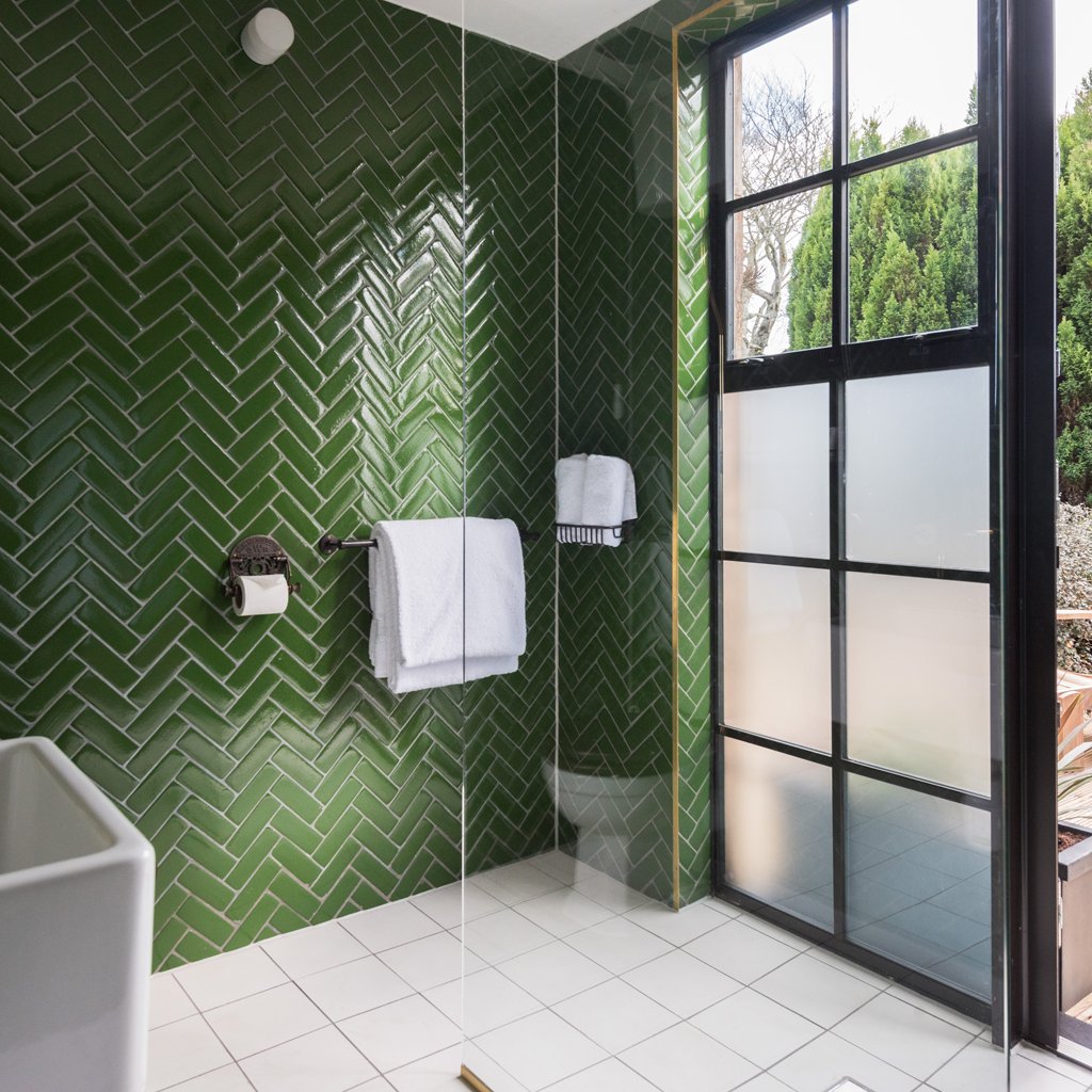
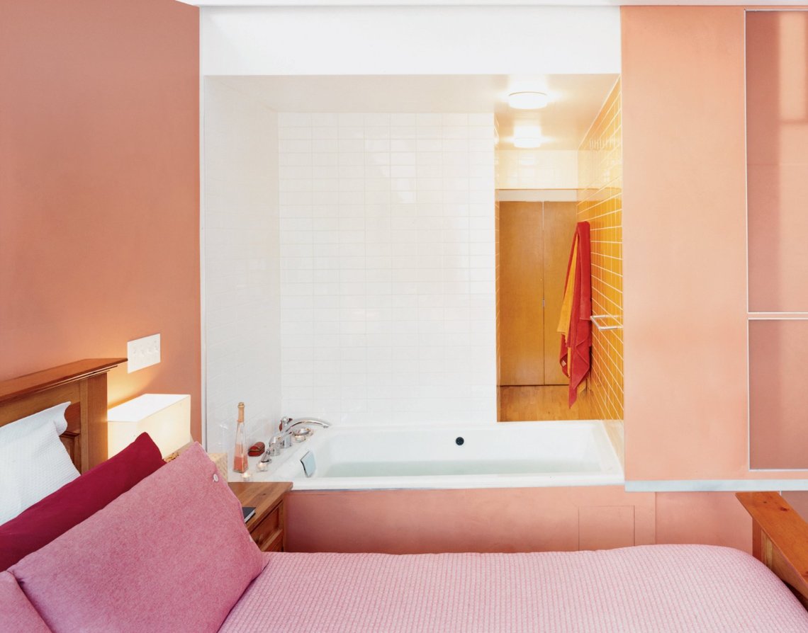
So now I’m getting itchy about the kitchen and the bathroom – do I want to matte-out the indigo bathroom paint to just improve the finish, or add skinny grid-layout navy tiles…. or go fucking nuts and install a wall of pepto-bismol pink tiles with paint to match? And can I scrape together some cash for green Bert & May herringbone tiles for my kitchen? (No, I cannot. And will not.) Above all I want colours that surprise, charm and feel like ME, not like shades I fell for because they were everywhere at the time. (It is here that I give a hard frown to pepto-bismol pink.)
But when you like colour this much, and hunt down particular shades, and indulge manias for one or another tone, you also get really jaded (O_o) really quickly. Decor is not cheap and it’s pretty dim to invest a wodge of cash in something you’ll be both bored and stuck with six months on. So the art is in identifying the colours that have a long halflife.
I have a blacklist, of course. I want to preface this by saying that I am not a design snob. I shop predominantly on the high street, I seek out bargains, and I don’t snottily judge other people’s tastes. But longevity is important to me, and these colours ain’t it.
– I will not use teal in my home. It is going into my parents’ home because a look round every room in their house tells me they like it, and want more of it. Okay. The client gets what makes the client’s heart sing. But I’ve seen teal played out continuously on the high street since the early noughties, from the vintage-inspired Urban Outfitters blouses I used to go indie-clubbing in, to the dreary shelves full of white and teal supermarket bedding. Teal is over. It will take a loooong time for it to be under again.
– Duck egg blue is similarly persona non-grata. It got swallowed up by Clapham and East Dulwich and did not survive the experience.
– Copper. NOPE. First we had those nice real, rough-around-the-edges pieces of reclaim, and the heat in its orangey glow was really intriguing and refreshing. Now Oliver Bonas has a continuous stream of overly shiny, spindly copper and rose-gold accessories, and I am quietly glad I never admitted any of it into my house, because I would only have to get rid of it, having tired of it thoroughly.
– I am eyeing mustard and chartreuse with suspicion, and indeed any jewel tones, because they are so very prevalent. Mustard is looking gorgeous again paired with that deep pink, but how long before that looks hackneyed? Burnt orange, I see you. I adore you, actually, but I see what you’re up to. Sneaking into every magazine spread and tucking yourself into corners of H&M Home. I love all of these colours, but these saturated shades are SO present that I feel I may lose interest before long.
It leaves you wondering which colours you’ll truly never get sick of. What can I invest in that will survive the merciless ravages of the high street?
I think I can always rely on some form of green; it’s a definite hallmark of my paintings, and I come back to it again and again in design. I think I’ll also always like deep, dark colours though there’s a challenge in pairing them with shades that wake them up. My navy blue bathroom is looking pretty commonplace right now, and I think I want to finish it off and give it a sense of polish, see if I like it regardless, and if not, fuck it, I’ll change it.
