
Dear reader, I know such constructs are but a marketing tool. A lens through which to focus the eye and the wallet of the concerned decorator.
Nevertheless, it irks me.
It irks me almost as much as “get involved, everyone!” campaigns and shows and breakfast radio segments titled “The Big ____” or “The Great British ____”. It’s an irrational thing to expend energy on, but it’s generally been observed that I have more energy than most, and it’s got to go somewhere. Don’t patronise me, you… you… word assembler, you. Away with your Blitz spirit-evoking, all-together-now, FOMO-tickling, Greatbritishpublic-baiting entreaties for my attention. I will give your Great British Event a miss, and my life will be sixpence none the poorer for doing so.
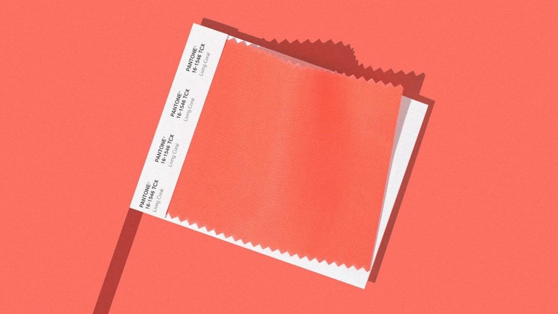
That long-overdue rant out of the way, a similar set of feelings stirs in me when I read that this year, we are all doing stuff with Living Coral. (Has anyone asked Coral how she feels about it?) I suppose psychologically I bristle at the expectation that because everyone else is doing it (they’re not, though after a mercilessly waged campaign by all of the major retailers, many of them will), I will too. I guess I’m entertaining delusions of being a beautiful and unique snowflake.
More practically though… you can go off a colour, you know?
Remember Duck Egg Blue? That perpetrator of “shabby chic” (even typing the words threatens to bring me out in hives).
Mass retailers work with a limited palette, because it’s cheaper. It’s much easier and more economical to maintain a supply chain and deliver the most competitive prices when your colour instructions consist of “more of that please”. Nuance isn’t necessary; a simple, effective colourway will send items flying off the shelves if they’re well-designed, affordable, and tap into the zeitgeist to the appropriate degree (as Fifth Harmony cooed, “not too much… well, maybe just enough”). But if you spend hours poring over design magazines, Instagram feeds, Apartment Therapy stories, it becomes rapidly obvious which colours are heavily oversaturating the market – and if you don’t, it will anyway, it might just take a few more weeks or months – more likely the former now that so many brands have really impressive affordable homeware ranges. En masse, we’re spending more on our homes than ever, and there ain’t enough colour in the world to supply us all at the optimum price point – something’s gotta give. That something, obviously, is visual diversity. And either way, we are a fashionable species, a tribal bunch, and we like to keep up with the Joneses. There are no influencers in the lizard kingdom. None of this is rocket science – if you’ve made it this far through this post, it’s a reasonable guess that you already know all this.
So, pick a colour, any colour, and paint EVERY SURFACE with it. Your office wall. The bus. You will get sick of it, of course.
But then, there is is Living Coral.
Have you ever tried to eat a jumbo packet of frankfurters in one sitting? Bet you were exhausted after sausage #2. Some tastes are just inherently exhausting. Lovely, but draining. I find the same is true of certain colours. For my tastes, colours with a little bit of white in them are particularly prone to this. Pinky red with a touch of white in it. A deep mint green. Banana yellow. A flash of it can look refreshing, surprising, left of boom. Any more and you feel weighed down, weary of it. Coral – and more so, the colours that aren’t coral but will, I guaranfucktee it, get called called coral – peach! salmon pink! DEFINITELY salmon pink – these colours are exhausting.
Especially when you see them in the same formations over and over again. Peach (sorry, Living Coral) with hanging planters. Coral with white and jute rugs and rattan furniture and a coffee table on hairpin legs. Probably a monstera in the corner (I love my monstera but you know what I’m getting at.) Coral in a hundred thousand “boho” rooms on Instagram and Houzz and Pinterest. Stop it. STOP IT. I’ve had to unfollow one Insteriors account because every single post, every SINGLE post, is another view, at a slightly different angle, of his peach and white and orange and straw and plant-heavy apartment, and I just… I can’t take it any more. I can’t look at the same images over and over and over again. Every time I pop online looking for a new idea, there they are. “Have you noticed me yet?” Worse, they eyeworm you and then the other, unusual colourways you might have dreamed up recede into the background behind a sea of coral and white and, if you’re really lucky, sky blue. I’ve got summertime sadness already and it’s only February. Make it stop.
If you’re still with me, forgive the rant, reader. I’m not too often inclined to such bitchy ramblings, but I’m in the planning stages of redecorating my parents house. I’m spending a lot of time on the internet. I have moodboards upon moodboards, a whole notebook full of lists and clippings and ideas, and I’ve found the perfect pink and white marble tile with a few hot little scarlet streaks through it, just smokey little whisper thin threats of colour. It’s like a cloud through rose-tinted specs. And I’m pondering what colour to paint the wall above the tiles, and it’s playing over and over in my head… “coral. Coral. Coral. ………..Coral. CORAL.”
